
The Mercator Projection and Its Distortions
Look at a world map. Open Google Maps if you don't have one at hand. It's a common design, and you know its main details well. Greenland is as big as Africa, and Alaska is similar in size to Brazil, right? No, both statements are false. What you're seeing is the effect of the Mercator projection, created by cartographer Gerardus Mercator in 1569. The Mercator projection has the problem of deforming the landmass as it approaches the poles, creating some quite striking errors…

The reproduction of three-dimensional objects on a two-dimensional plane is never free of inconveniences, but this goes much further. Responding to the previous question, the truth is that Brazil is almost five times larger than Alaska, and Greenland has an area 14 times smaller than Africa. Another very useful way to detect and visualize distortions in the Mercator projection is by applying the so-called Tissot's indicatrix, presented by French cartographer Nicolas Auguste Tissot in 1859 and 1871.


Why We Still Use Mercator
So why do we use Mercator if it's so inaccurate? Although the projection has difficulties preserving size, it does a good job at preserving directions (after all, that was Gerardus's goal), which is very useful in navigation. However, the prevalence of Mercator as “the” map has been the center of multiple discussions and controversies over the years. Almost all new projections were presented as “the definitive replacement” for Mercator, but experts never reached an agreement, and astrophysicist John Quincy Stewart (1894-1972) compared the search for the perfect projection to “trying to round pi”.

Other Projections
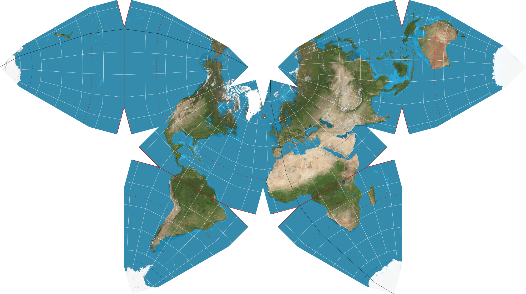
What other projections are out there? Where do we start? One of the most recognized is the Robinson projection, adopted by the National Geographic Society in 1988 as a replacement for the Van der Grinten projection. Now, that change barely lasted ten years, because in 1998 the society decided to favor the Winkel-Tripel projection. The Dymaxion projection seems made by someone very angry and with scissors in hand, the “Waterman Butterfly” is almost a leaf extracted from the Rorschach test, and the Gall-Peters projection sowed chaos with its idea of “cartographic imperialism”. Not even xkcd could resist.